
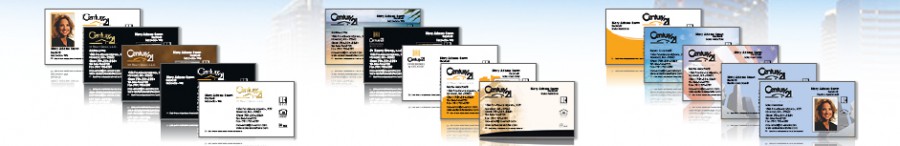
Business cards are a must have for any real estate agent. They’re inexpensive, they’re portable, and they offer a lot of information in a little bit of space. The only problem is that everyone has one. It can be hard to stand out from the pack when it seems like everyone is working from the same layout. Fortunately, there are more options out there than you might realize when it comes to Century 21 business cards.
- Rounded corners: Century 21 business cards with rounded corners are easy to spot in a stack. The rounder edges are smooth and visually appealing, with a more modern look.
- Photos: Putting your photo on your business card is an extremely common practice in the real estate world, and a great way to add a personal branding element to your card. But if you are planning to use a photo, choose wisely. Make sure your photo is professional, up-to-date, and sends the right message about your brand.
- Background image: When you’re dealing with the limited space offered by a business card, it’s vital to use every element effectively. Don’t overlook the power of the background image to convey your message! After all, a picture says a thousand words. Whether it’s a sandy beach, a luxurious mountainside chalet, or an elegant city skyline, the image you choose for the background of your Century 21 business card can tell prospects a lot about your business.
- Foil business cards: A touch of foil is an easy way to give your card an extra edge when it comes to standing out from the rest of the stack.
- Silhouettes: Real estate agents have been adding their photos to business cards for decades, but using a silhouette photo still feels new. The crisp image and up-to-date appeal of the silhouette photo make it a great choice for Century 21 agents who specialize in luxury homes or commercial real estate.
- Bold colors: Feel like your card is getting lost in a seas of white backgrounds? A tweak as simple as changing the background color can make a difference. The bright yellow of the Century 21 logo is a good choice for a background, or consider an all-black card background for a real estate business card that really stands out.
- Vertical business cards: Switching your card layout from horizontal to vertical isn’t a big change, but it can make a big difference in memorability. Since the vast majority of cards people hand out are horizontal, it’s much easier for prospects to remember a vertical Century 21 business card when they receive one.
- Ultra thick business cards: Giving your business cards a little extra heft is a great way to ensure that your business is given extra weight in your prospect’s mind. Ultra thick real estate business cards feel slightly heavier in the hand and have a rich texture that shows you’re serious about marketing your business – and your client’s property.